
In this tutorial, we will show you how to easily create data map visualization in Kibana. Maps enable you to present geographical data in a way that is easy to understand and interpret at first sight of the same data. For example, if you are collecting system authentication logs and processing them using Elastic Stack, you might want to create the map visualization to help you get to know who is logging into your system from which geographical location.
Create Data Map Visualization in Kibana
In order to demonstrate how to create data map visualization in Kibana, we will use SSH authentication events that are being sent to and being processed by our Elastic Stack.
We already have the SSH events on Elastic Stack as can be seen in the Kibana Discover menu in the screenshot below;
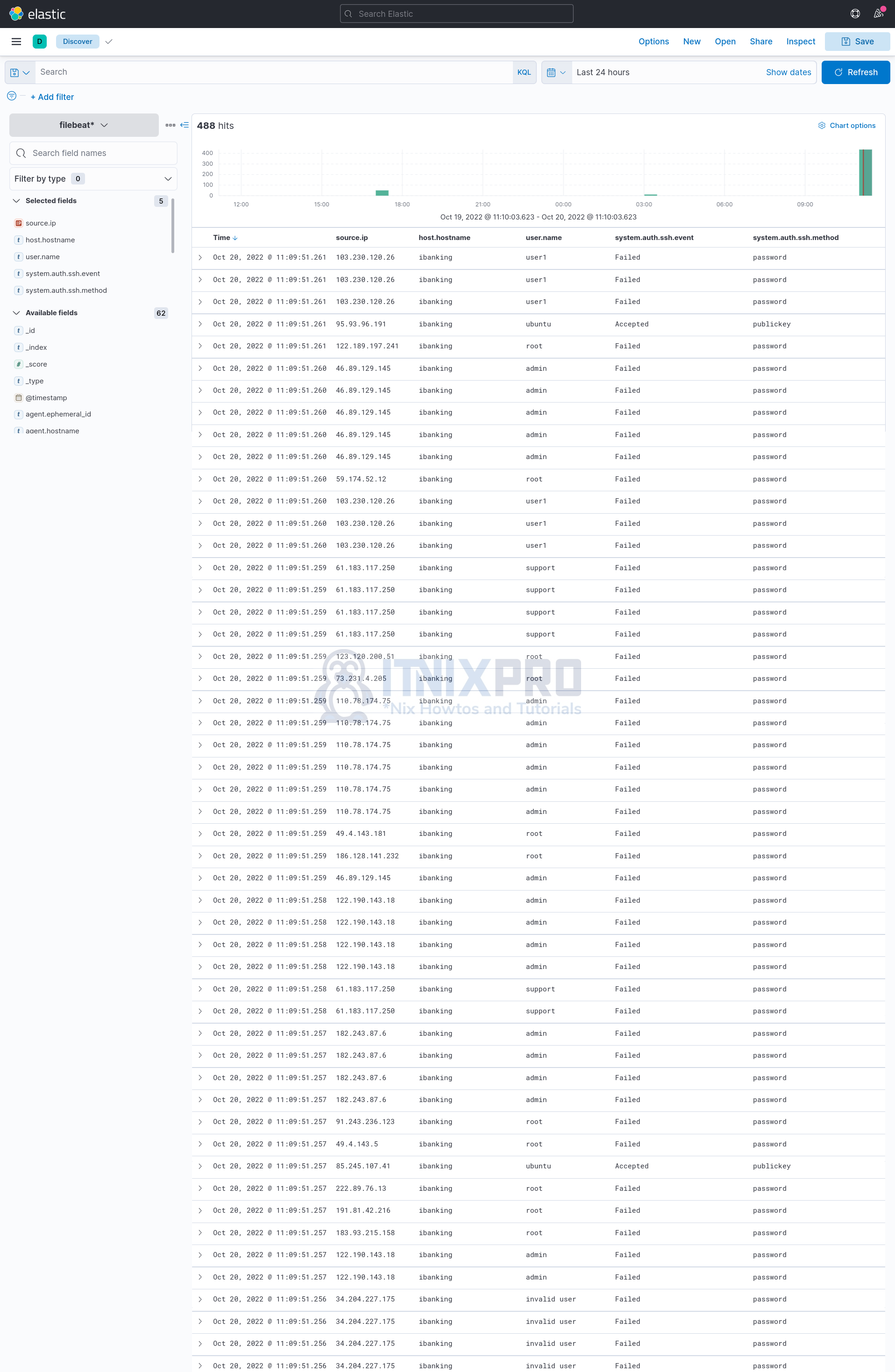
Please note that the data used in this guide is just made up for the purposes of tutorial!
So how can you create data map visualization in Kibana?
To begin with, ensure that the event fields you want to use visualize your data has the geo_point field type.
In this example, our Filebeat index has a number of event fields whose type are geo_point;
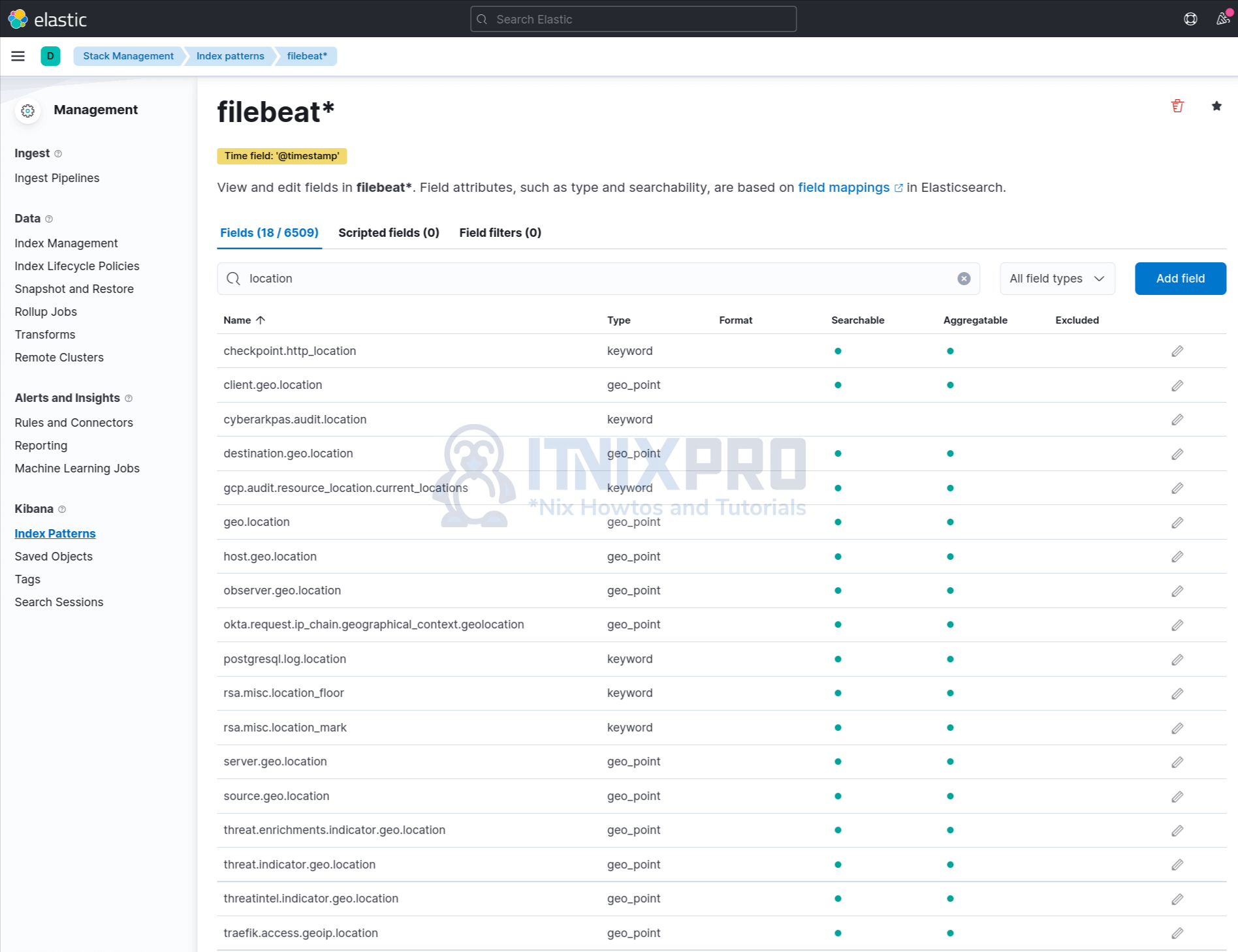
You can read more about Geo fields on Elastic page.
Once you confirm that the fields that you want to use to visualize the data are of type geo_point, then proceed to create map visualization on Kibana.
Hence;
- From the Kibana Analytics menu, either navigate to Dashboard > Create Dashboard > All Types > Select and click Maps;
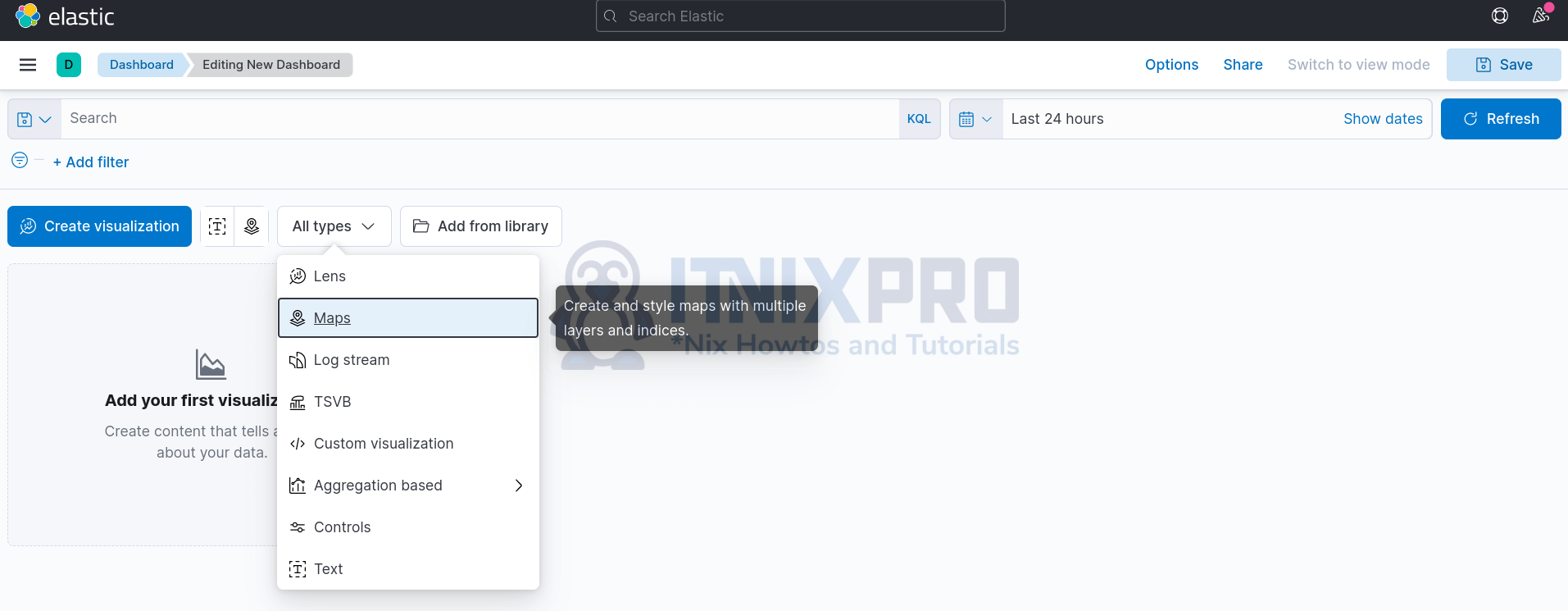
- Or
- Simply under Analytics Menu, Click Maps > Create map.
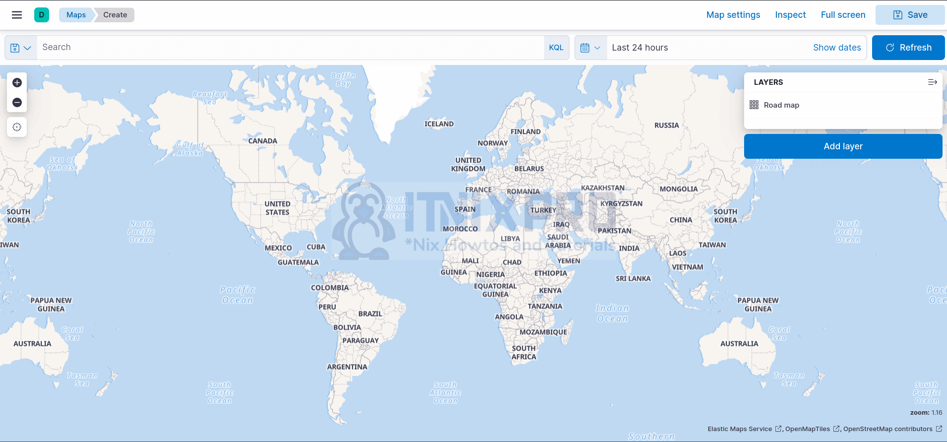
To begin the creation of Kibana maps, you need to add the Choropleth layer. Choropleth maps “is a type of statistical thematic map that uses pseudocolor, i.e., color corresponding with an aggregate summary of a geographic characteristic within spatial enumeration units“. It shades the world countries based on the traffic from the respective country. The higher the traffic, the darker the shades, the lower the traffic, the lighter the shades.
Hence;
- Click Add layer from the maps layout
- Under Add Layer > All > select Choropleth.
- Under the Boundaries source;
- Leave the default selected option, Administrative boundaries from the Elastic Maps Service
- On the Layer option, choose World Countries.
- Join field will automatically be populated with an option, ISO 3166-1 alpha-2 code.
- Under Statistics source;
- Select your index pattern, e.g filebeat*.
- on Join field, select a field that matches with option used on the Join field under the Boundaries source.
- Hence, since we opted for ISO 3166-1 alpha-2 code under the Boundaries source, in the Statistics source join field, we chose source.geo.country_iso_code field.
- Immediately you select a correct field, the map will change depending on the availability of the matching traffic.
- You can adjust your time range accordingly.
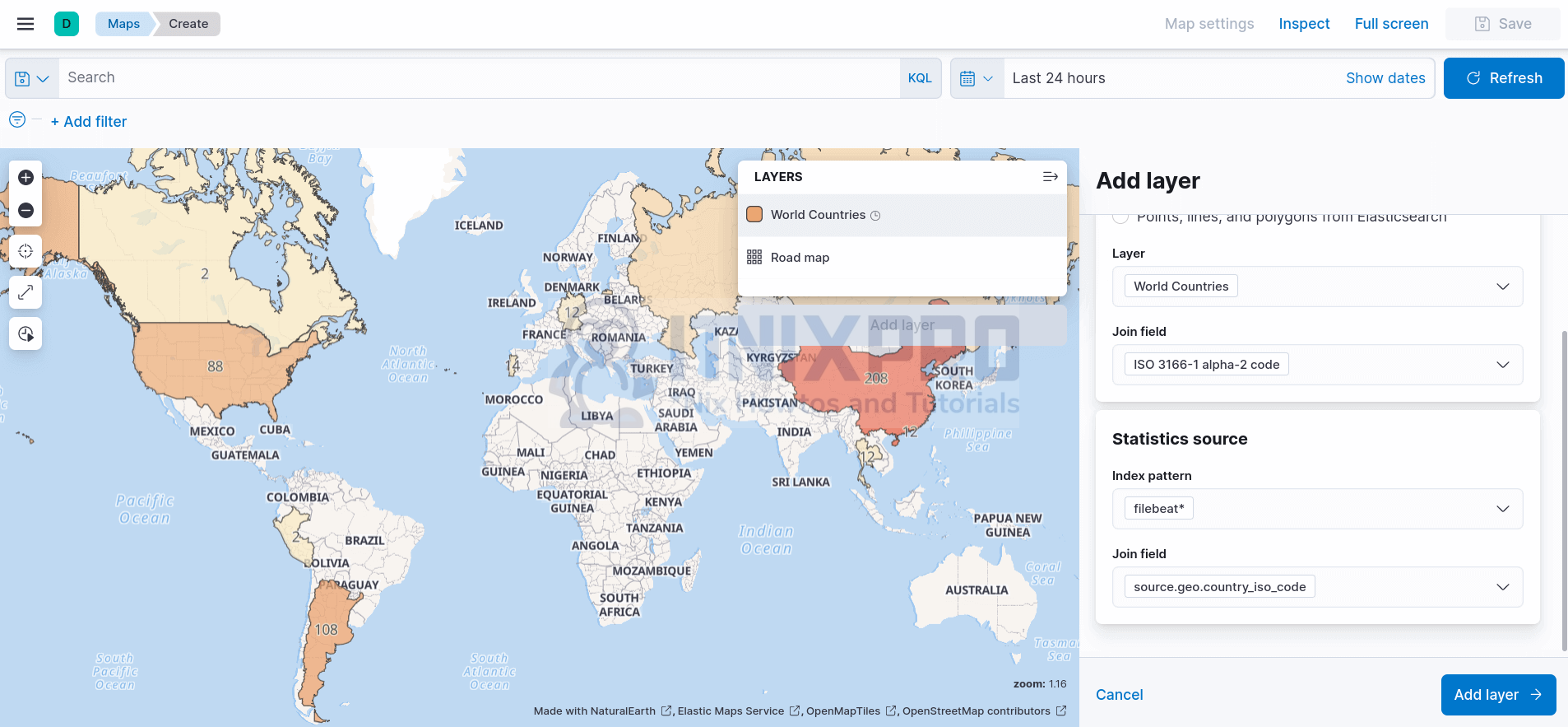
- Click Add layer
- You can update the layer settings as you wish.
- Close the layer once done editing.
Next, create your Elasticsearch data Map Visualization.
Hence;
- Click Add layer
- Under Add Layer > All > select Documents.
- Select Index Pattern, e.g filebeat*.
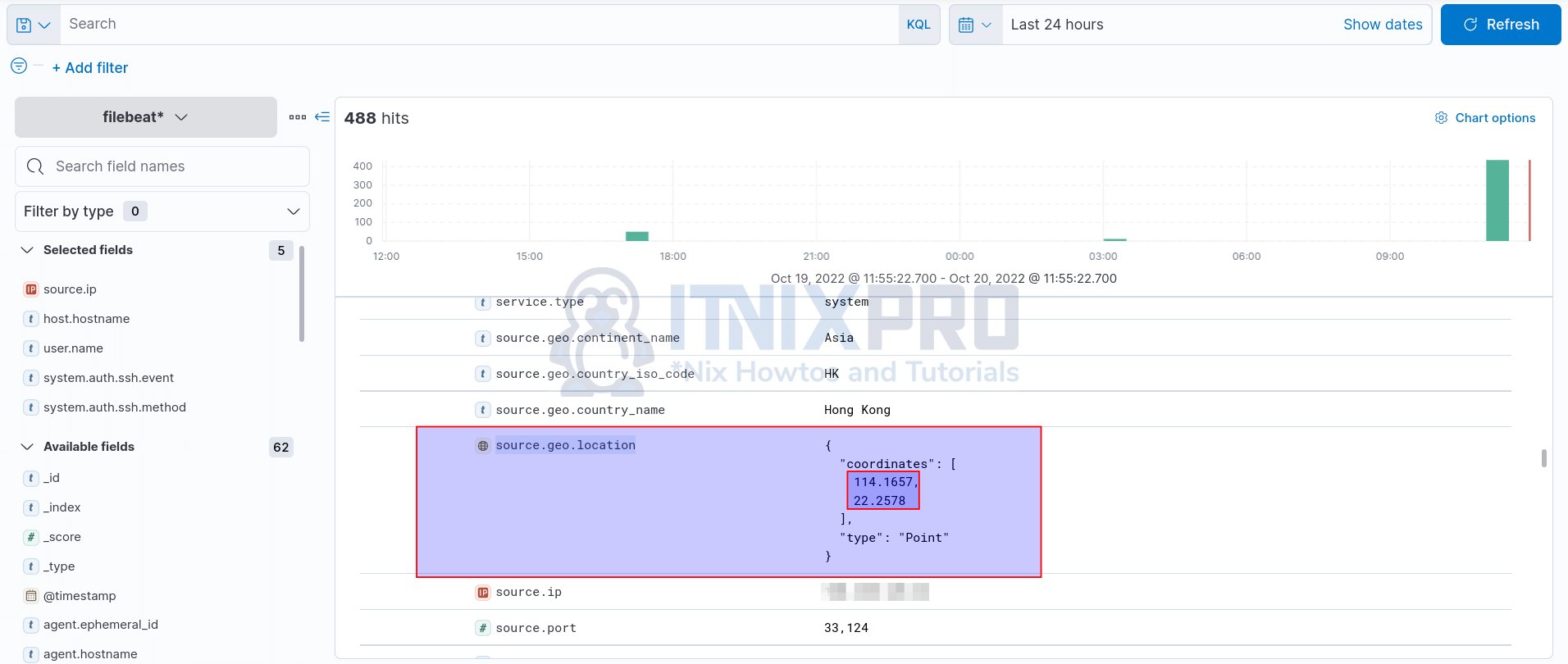
- Select Geospatial field. This should be the field that has both Longitude and latitude. In our example, the field with Longitude and latitude is source.geo.location. See sample below from our events;
- The layer settings now look like;
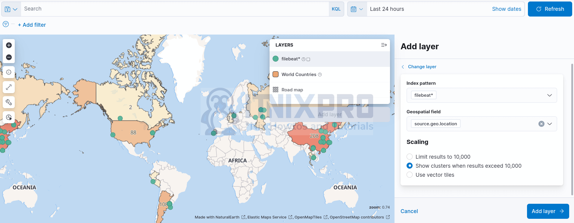
- Click Add layer.
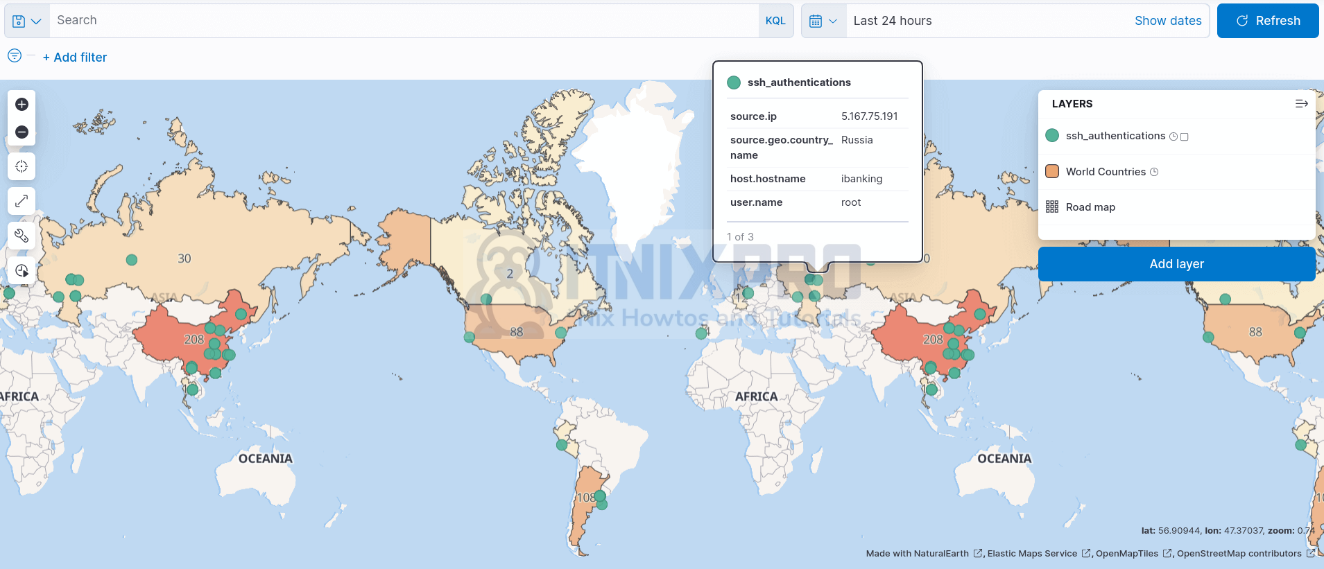
- Change the Name of the layer e.g, ssh_authentications.
- Add more tooltips to display some information when you hover your mouse or click a source on the map. Such tooltips as;
- Source IP
- Source Country
- Destination Host
- Username
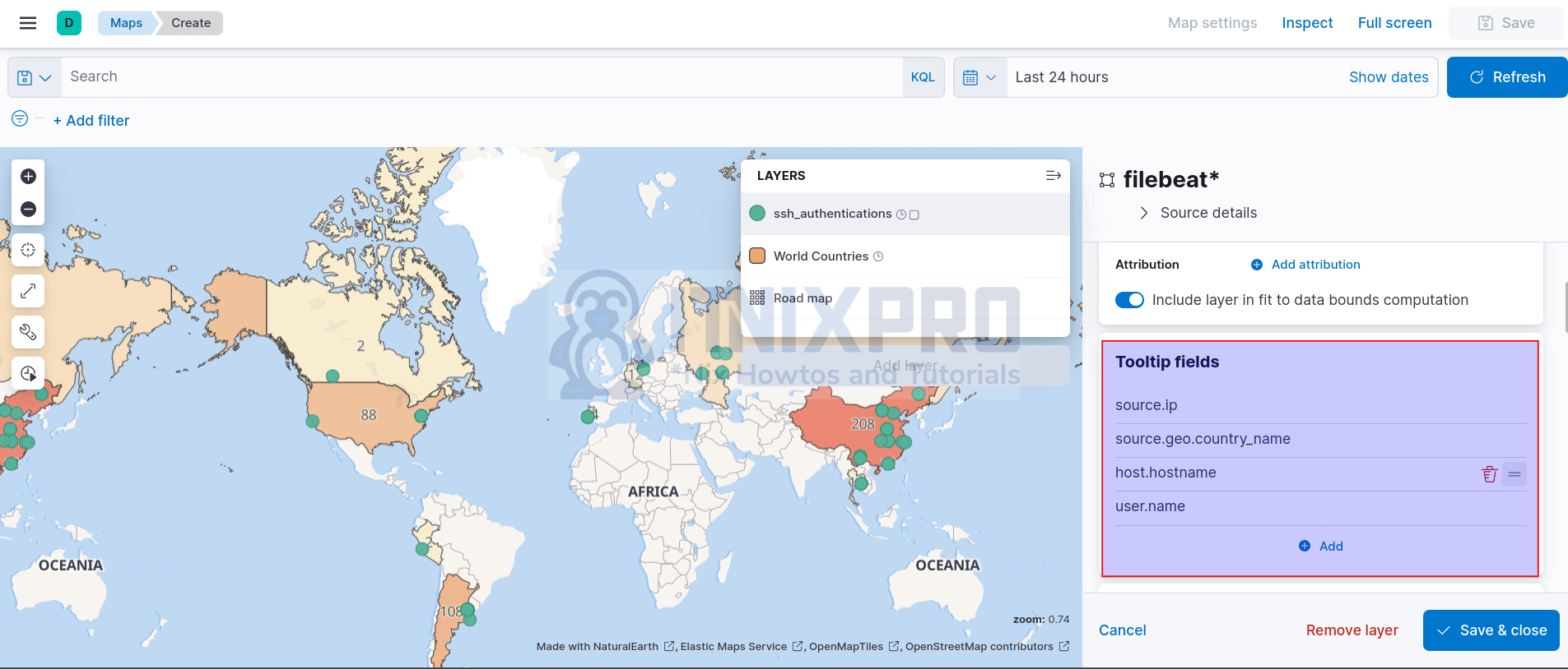
- Go through other layer settings and Save & close when done.
And your data map visualization is now ready;
You can then save your map to your dashboards.
And that is it on how you can create data map visualization in Kibana.